Locale Design Build is honored to have been awarded a Blend Award for 2019, 2020, and 2021
The Blend Awards encourage and reward builders, architects, and home owners
to blend newly remodeled or constructed homes and businesses into the fabric of
Minneapolis and St. Paul neighborhoods. See more at Blendaward.org
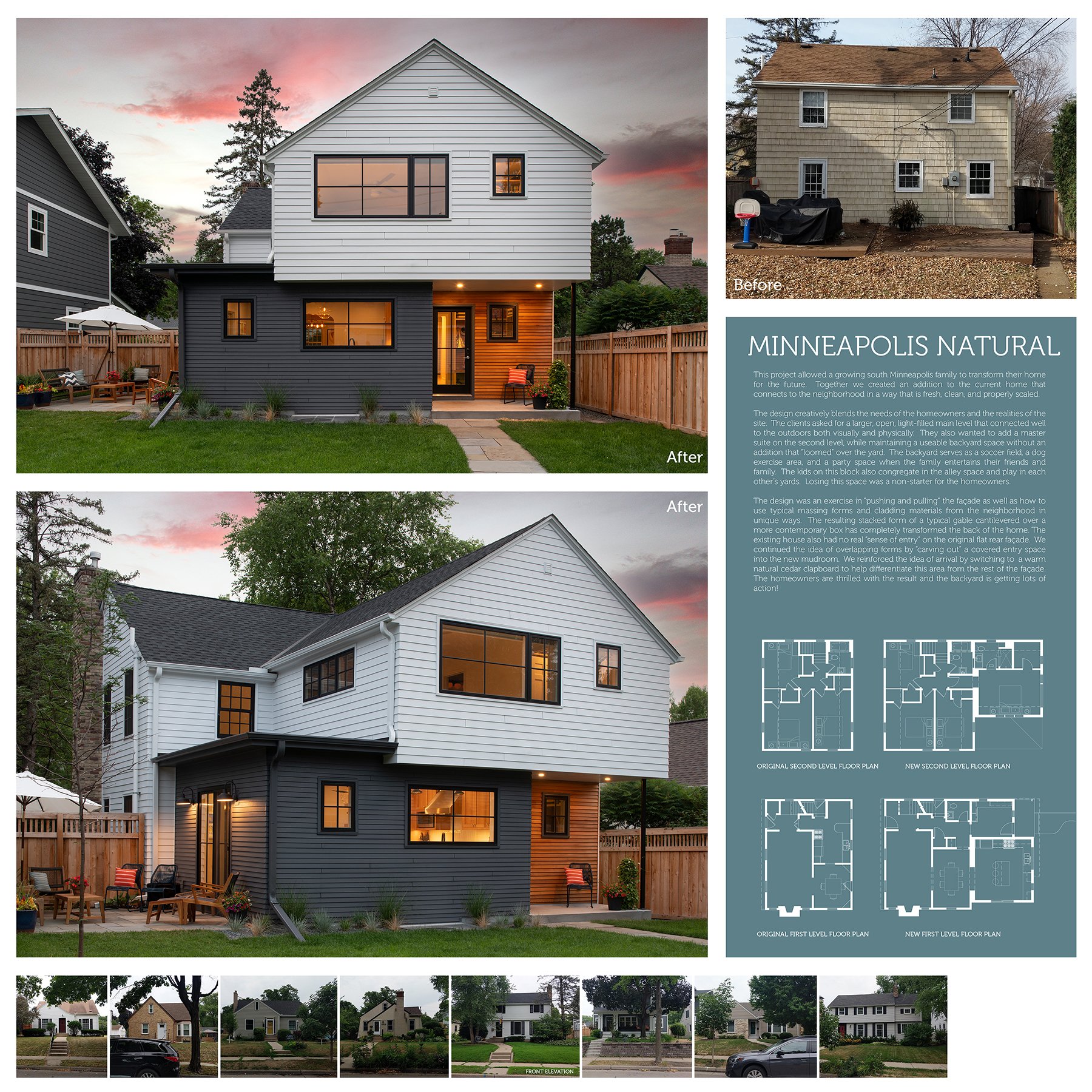
Minneapolis Natural
This project allowed a growing south Minneapolis family to transform their home for the future. Together we created an addition to the current home that connects to the neighborhood in a way that is fresh, clean, and properly scaled.
The design creatively blends the needs of the homeowners and the realities of the site. The clients asked for a larger, open, light-filled main level that connected well to the outdoors both visually and physically. They also wanted to add a master suite on the second level, while maintaining a useable backyard space without an addition that “loomed” over the yard. The backyard serves as a soccer field, a dog exercise area, and a party space when the family entertains their friends and family. The kids on this block also congregate in the alley space and play in each other’s yards. Losing this space was a non-starter for the homeowners.
The design was an exercise in “pushing and pulling” the façade as well as how to use typical massing forms and cladding materials from the neighborhood in unique ways. The resulting stacked form of a typical gable cantilevered over a more contemporary box has completely transformed the back of the home. The existing house also had no real “sense of entry” on the original flat rear façade. We continued the idea of overlapping forms by “carving out” a covered entry space into the new mudroom. We reinforced the idea of arrival by switching to a warm natural cedar clapboard to help differentiate this area from the rest of the façade. The homeowners are thrilled with the result and the backyard is getting lots of action!
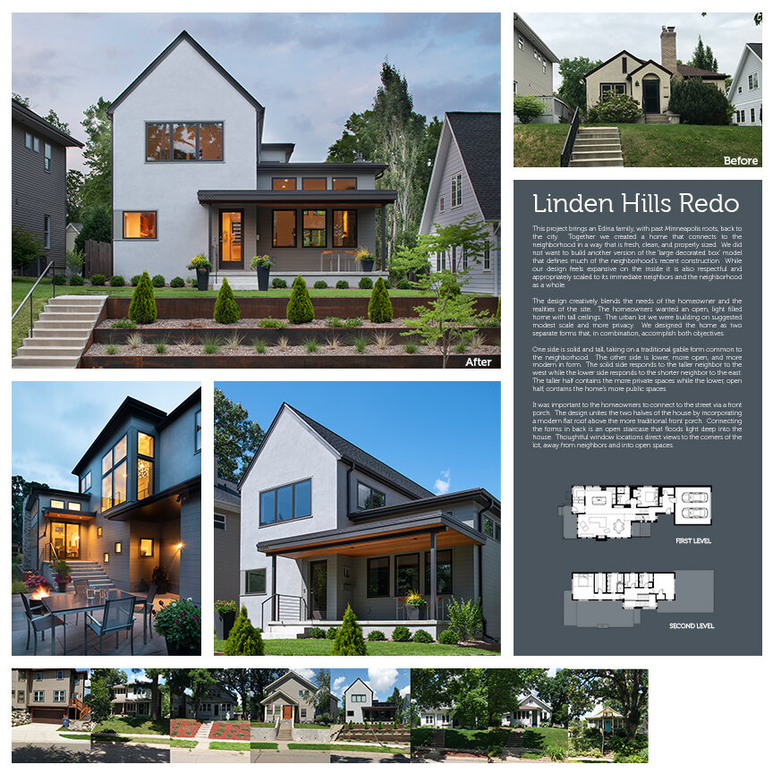
Linden Hills Redo
This project brings an Edina family, with past Minneapolis roots, back to the city. Together we created a home that connects to the neighborhood in a way that is fresh, clean, and properly sized. We did not want to build another version of the ‘large decorated box’ model that defines much of the neighborhood’s recent construction. While our design feels expansive on the inside it is also respectful and appropriately scaled to its immediate neighbors and the neighborhood as a whole.
The design creatively blends the needs of the homeowner and the realities of the site. The homeowners wanted an open, light filled home with tall ceilings. The urban lot we were building on suggested modest scale and more privacy. We designed the home as two separate forms that, in combination, accomplish both objectives.
One side is solid and tall, taking on a traditional gable form common to the neighborhood. The other side is lower, more open, and more modern in form. The solid side responds to the taller neighbor to the west while the lower side responds to the shorter neighbor to the east. The taller half contains the more private spaces while the lower, open half, contains the home’s more public spaces.
It was important to the homeowners to connect to the street via a front porch. The design unites the two halves of the house by incorporating a modern flat roof above the more traditional front porch. Connecting the forms in back is an open staircase that floods light deep into the house. Thoughtful window locations direct views to the corners of the lot, away from neighbors and into open spaces.
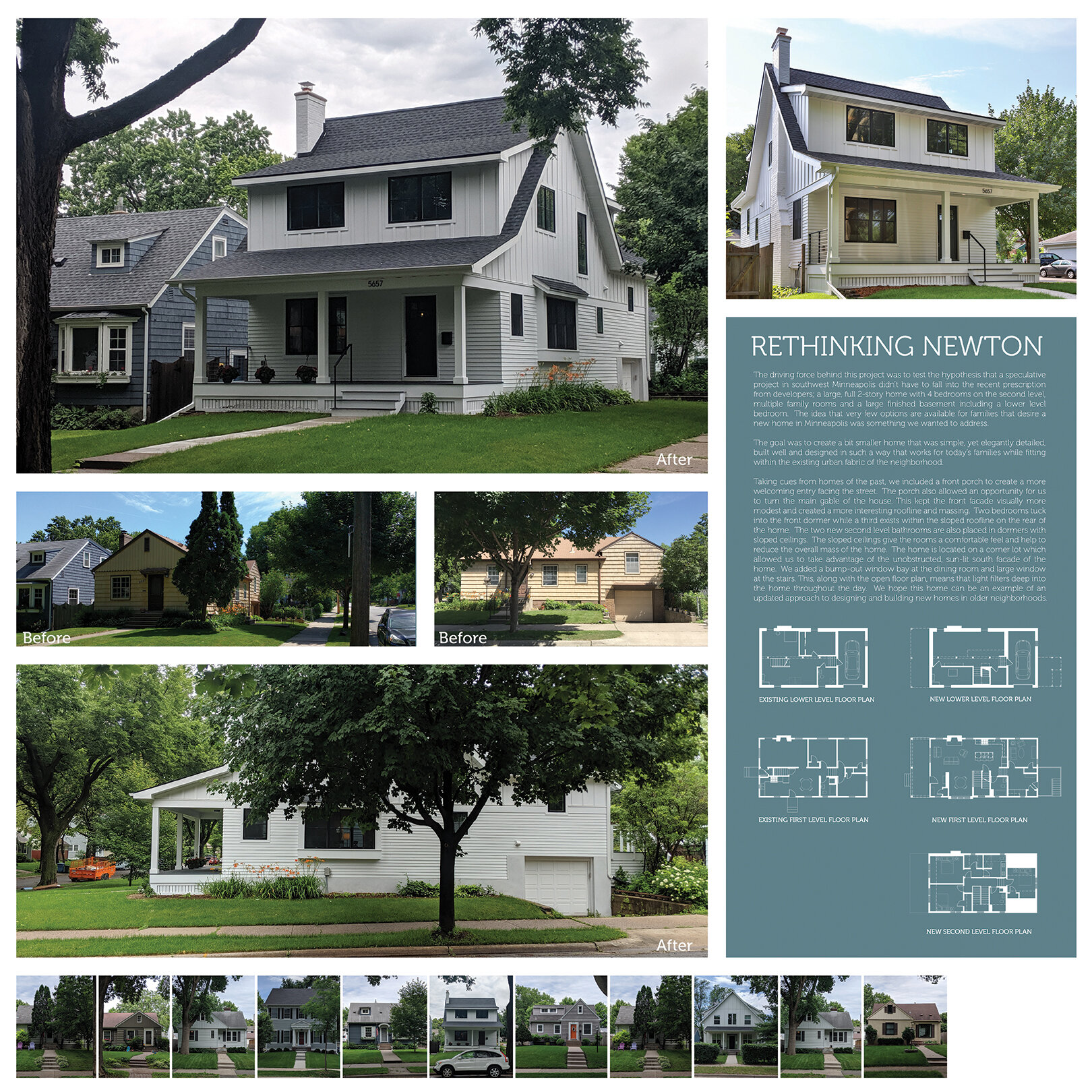
Rethinking Newton
The driving force behind this project was to test the hypothesis that a speculative project in southwest Minneapolis didn’t have to fall into the recent prescription from developers; a large, full 2-story home with 4 bedrooms on the second level, multiple family rooms and a large finished basement including a lower level bedroom. The idea that very few options are available for families that desire a new home in Minneapolis was something we wanted to address.
The goal was to create a bit smaller home that was simple, yet elegantly detailed, built well and designed in such a way that works for today’s families while fitting within the existing urban fabric of the neighborhood.
Taking cues from homes of the past, we included a front porch to create a more welcoming entry facing the street. The porch also allowed an opportunity for us to turn the main gable of the house. This kept the front facade visually more modest and created a more interesting roofline and massing. Two bedrooms tuck into the front dormer while a third exists within the sloped roofline on the rear of the home. The two new second level bathrooms are also placed in dormers with sloped ceilings. The sloped ceilings give the rooms a comfortable feel and help to reduce the overall mass of the home.
The home is located on a corner lot which allowed us to take advantage of the unobstructed, sun-lit south facade of the home. We added a bump-out window bay at the dining room and large window at the stairs. This, along with the open floor plan, means that light filters deep into the home throughout the day. We hope this home can be an example of an updated approach to designing and building new homes in older neighborhoods


